I used to find selecting paint colors a daunting task.
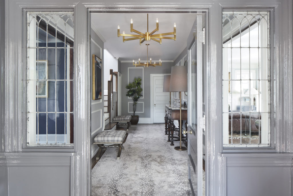
Designing a foyer is an excellent opportunity to make a lasting impression.
A home’s entryway is an essential part of the house, and one that sees high traffic. Investing in quality pieces, and mixing in personal touches is key to defining this space.
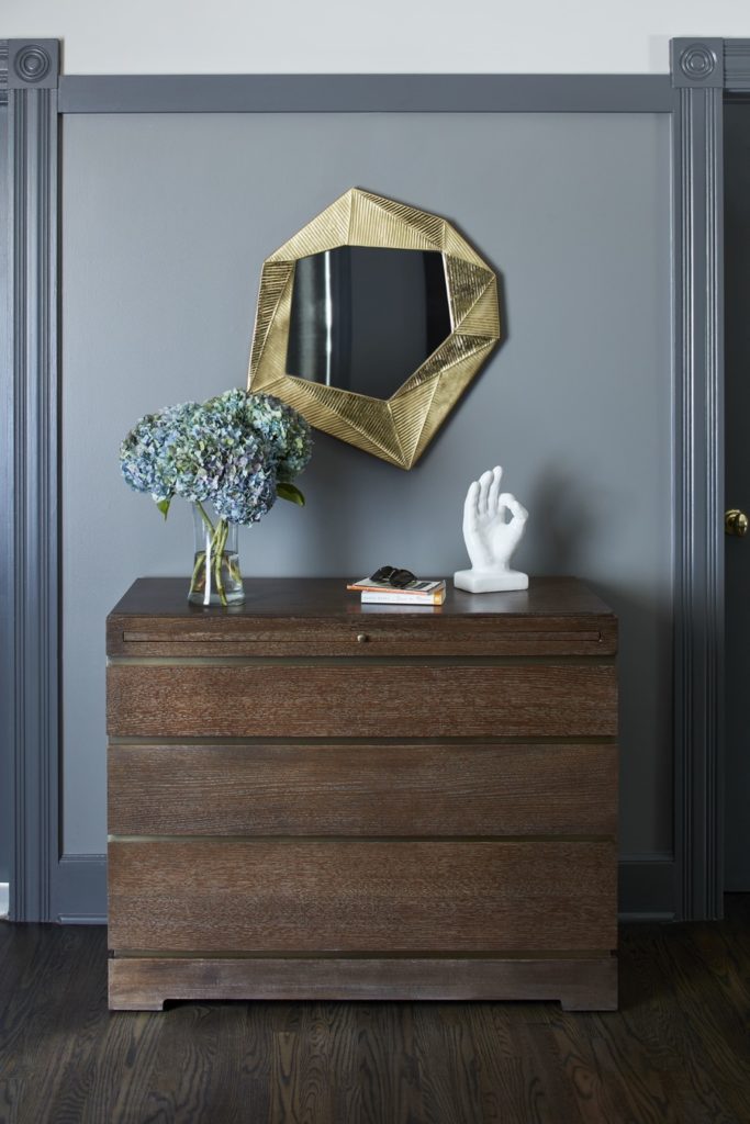
This home makes a striking first impression thanks to high-gloss paint by Benjamin Moore and modern brass light fixtures by Robert Abbey. Sleek tones of gray are echoed throughout the entryway via a seriously stylish area rug, Vanguard ottomans, and Robert Abbey standing lamps.
The space is streamlined and functional, yet refined, thanks to minimal accessories such as an Arteriors mirror rimmed in soft brass and pops of greenery.
Why go bold with color?
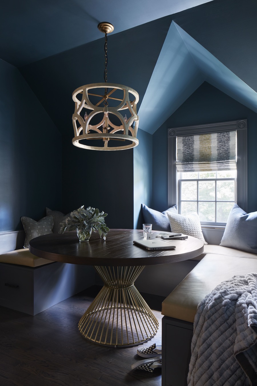
I went full throttle in this kids’ study by using a rich teal color, and wrapping it around the room on the walls and the ceiling. This continuity of color allows the corners of the room to fade away, and the darker shade enables you to focus on the furnishings, the window treatment, and just maybe, the homework.
The ceiling in the study room is much lower than in the adjacent kids’ lounge, which the wrapped, rich color accentuates. A classic architectural technique, there is a great sense of expansion as you enter the larger, brighter space.
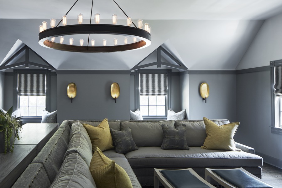
The risk in using a bold paint color is that it can result in the room feeling too dark and cave-like when that is not your intention, or that the color can come out too bright. The lounge is a huge room, so I made sure to select colors that are muted, as color always feels more intense on a larger scale.
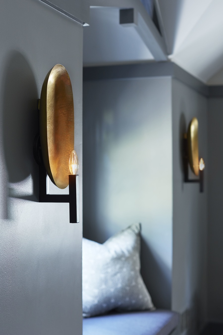
The rich paint colors on the walls and trim by Benjamin Moore add weight and depth to what was previously an architecturally bland room. I used the darkest paint color in the space on all of the trim to highlight these newly added architectural details—the brackets at the window seats and horizontal plate rail around the room.
By using a darker color on the walls below the plate rail, this voluminous room feels grounded. Using the same paint color on the walls above the plate rail and the ceiling visually quieted down the multiple ceiling planes and angles.
I refinished the floors to be warm and quiet—very soothing.
This project was incredibly rewarding. Colors, furnishings, and accessories worked cohesively together to create two harmonious spaces that make a major impact on the home.
