A good portion of my work revolves around color. What pairs well with what, which hues evoke certain moods, what kind of message a particular color conveys…the list is endless. In Color Coded, I match a beautiful, of-the-moment shade to great interiors across the web. Our pick for summer: a bold salmon such as Benjamin Moore’s Bubble Tea (CSP – 1180). This versatile pink tone radiates the liveliness of summer days while still feeling cool and refreshing. Dial it back to a cool pastel for a subtler room, or supersaturate it for an eye-catching and exciting punch in a larger space.
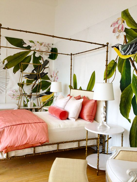
First up: a tropical canopy setup designed by Oly Studio’s Kate McIntyre and Brad Huntzinger. Here, salmon and cream bedding alternates in a delicious pinwheel of contrasting yet complimentary hues. The room is rounded out by natural elements and a beautifully painted jungle mural that adds a touch of the wild to this summer spread.

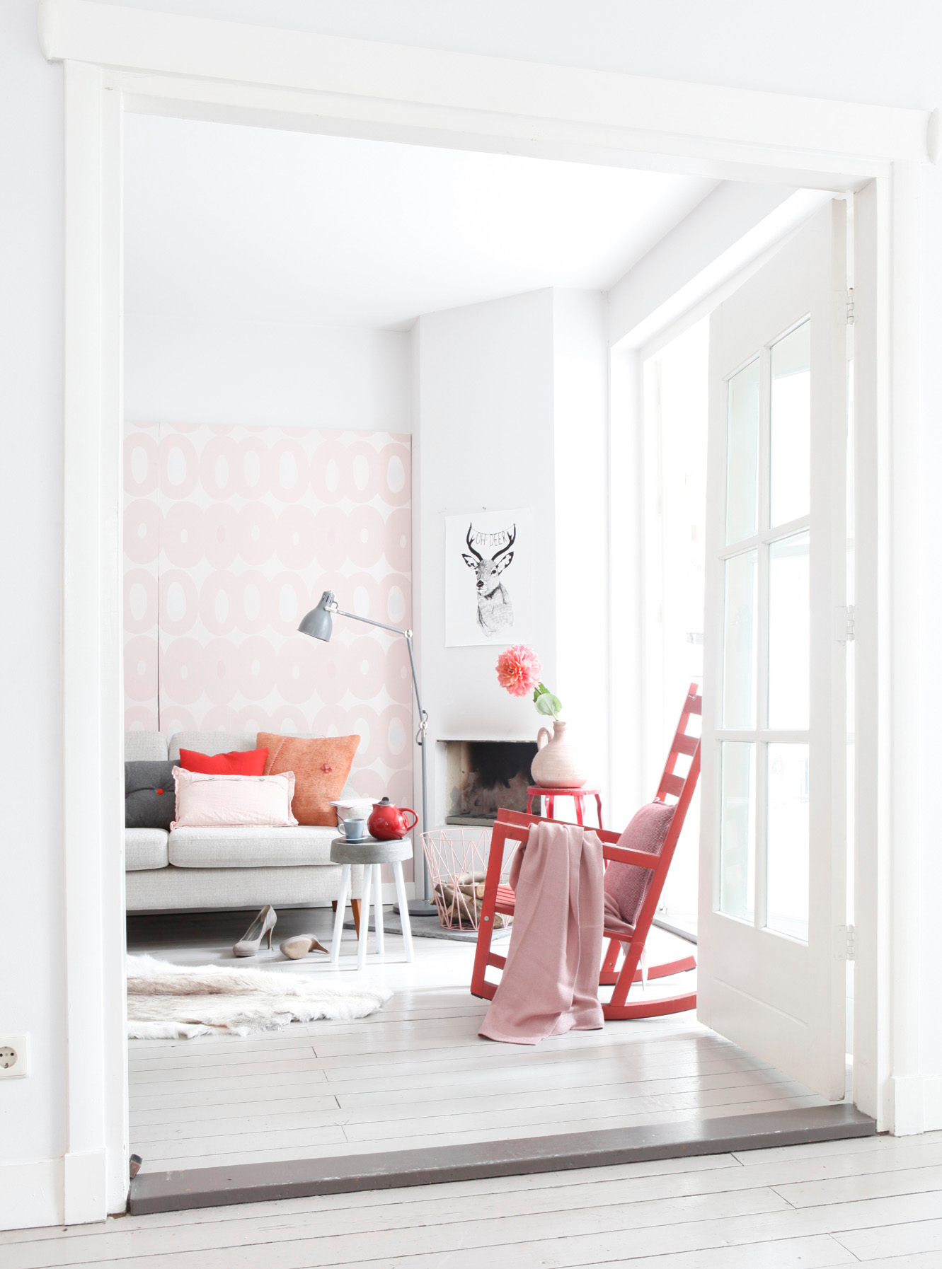
This pink-orange shade is a beautiful standalone as well. Case in point: Kim Timmerman‘s confident design philosophy turns a stark white living room into a sophisticated backdrop for a smattering of bright focal points.

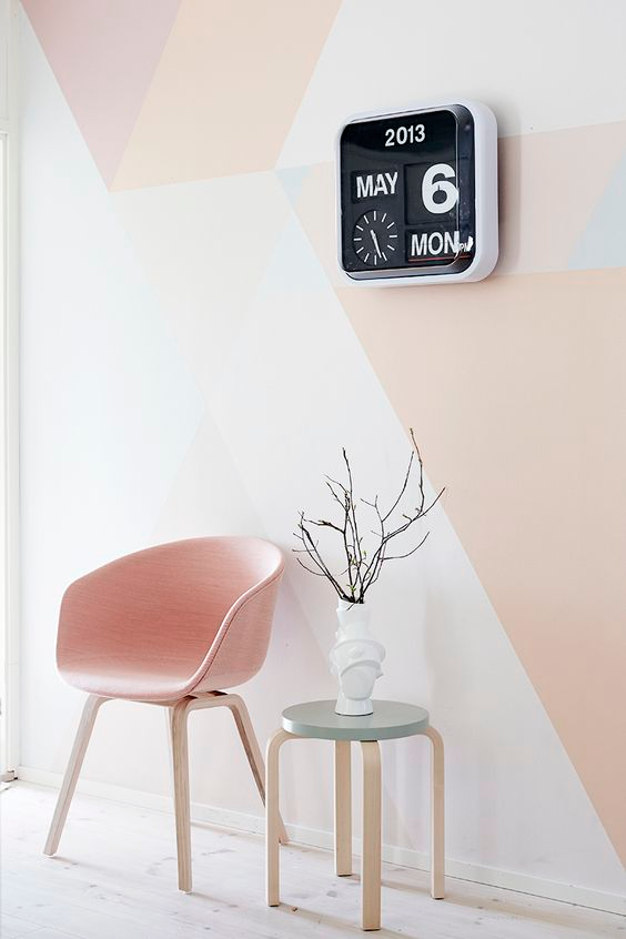
If soft rose is more your thing, Riikka Kantinkoski has your fix. His delicately constructed space has a minimalist, Scandinavian sensibility to it. He plays with a “diluted” version of the color in a way that elevates the room. His work is a masterclass in contrasts, pairing rounded, pastel furniture with a sharp mosaic wallpaper, and ultimately rounding out the interior with a jet-black industrial-style clock.


