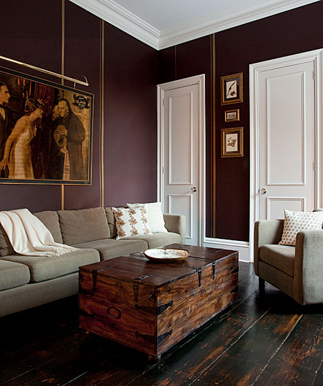
A good portion of my work revolves around color. What pairs well with what, which hues evoke certain moods, what kind of message a particular color conveys…the list is endless. In Color Coded, I match a beautiful, of-the-moment shade to great interiors across the web. Today, Brinjal by Farrow & Ball takes the stage. A sophisticated reddish-purple hue, the color’s name is inspired by the rich tones of the aubergine (that’s eggplant in layman’s terms).

As a full wall color, the shade speaks to an erudite, mature sensibility that should be offset by lighter colored furniture. Intricate Victorian flourishes and Rococo-style accessories always shine in these kinds of spaces. So do indulgent gold accents: gold faucets, trims, and patterns pair royally well with purple and are sure to impress your guests.
Brinjal can also succeed as a delicate underpinning of color, perfect for kitchen islands and moldings. Its understated vibrancy works beautifully with plush furniture, throw rugs, and even bouquets of flowers, especially in a pale, airy room. Brinjal’s dual nature as an imperial shade and bohemian companion makes it an ideal addition to any space.


Amazing blog, love this information