My process always starts with how clients want to feel in the space, and color plays a major role in that.
When my clients are looking to feel relaxed or rested, softer palettes are best. When they want to feel energized or are looking for a dose of drama, bold colors are the way to go.
A Colorful Transformation
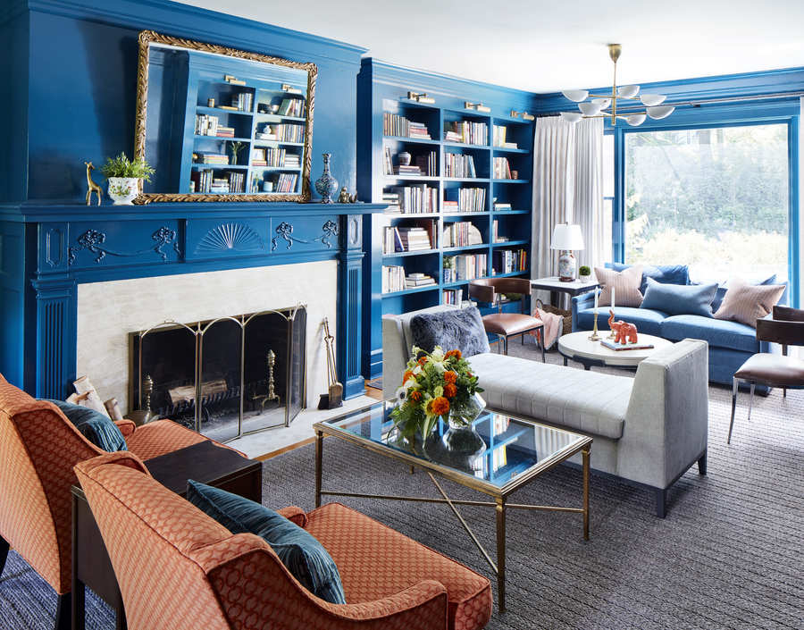
Rich colors on walls and trim are ideal for adding punch and drama to this traditional architecture.
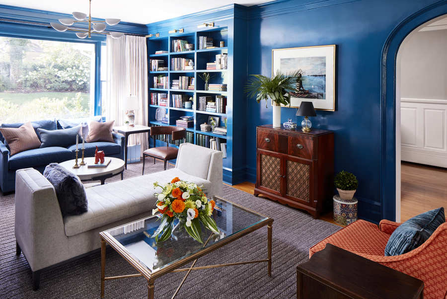
The request of the client for this living room was always “I want bright, peacock blue.” We came up with the scheme to do the color from the crown molding to the base, including every bit of trim AND every wall…we basically lacquered everything peacock blue from top to bottom. With architecture this fantastic, you can get away with quite a lot design-wise. The sky’s the limit with great color, but we always look for depth of color, which is why we tested many colors before we knew we had the right one: Benjamin Moore Slate Teal.
When working with bold color, it’s important to layer in neutrals and different degrees of depth of the color you’re using. The peacock blue we used in this project is lacquered on the walls in a high gloss and then repeated in a dustier version in the strie velvet on the sofa and on the shiny velvet faux-fur and wool pillows. You’ll see that color in different values repeated throughout the space. That gives depth and dimension to a high-value color palette.
I cannot recount the number of times we’ve been hired to remedy a kid’s room after the parents sweetly allowed the kids to select the paint color. The trick is to select a color with more complexity — even if you want to go bright and bold.
 Wanna’ know how to make your home feel more welcoming?
I’ll send you tips on how I do it.
(Bonus: Shopping list included)
Get the Guide
The risk in using a bold paint color is that it can result in the room feeling too intense, neon, kinetic or dark and cave-like. In large rooms, be sure to select colors that are muted, as color always feels more intense on a larger scale.
The room’s exposure (direction and amount of windows/light) and how you intend to use the space, as well as how you want to feel in the space, will play a huge role in the color that will be right for you.
I don’t have a signature color – we take each project into careful consideration, with fresh eyes to select the best palette for each space. This eclectic living room design called for a powerhouse peacock blue that would set the tone for the rest of the first floor.
The Living Room
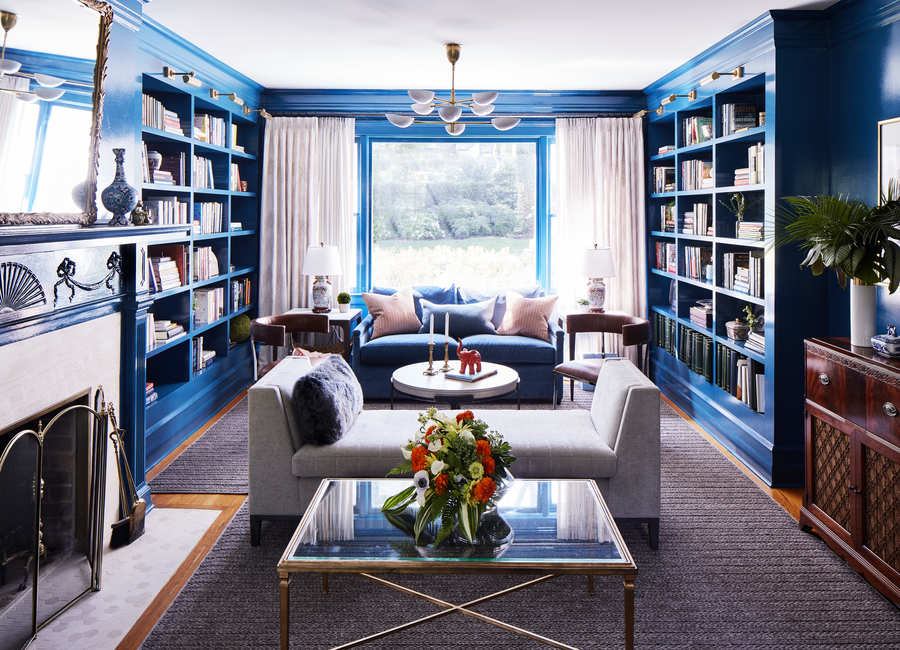
I worked to create a sense of place with this eclectic living room design, a destination to keep gravitating back to with: Bold color, layered lighting, with a table near every seat, and plenty of room to lounge, play a game and read a book. This project was all about creating groupings and spaces that are functional and incredibly inviting so that everyone wants to spend time in this living room.
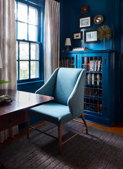
A side nook on the east side of the living room is ideal for a game of chess or puzzles with the kids. The table is the client’s own, and flanked with Vanguard chairs in Romo’s Quinton Kingfisher fabric.
Chaises are great for lounging. I placed a Vanguard Chaise, upholstered in Pindler’s Baylor fabric, near the center of the living room to allow for uninterrupted conversation flow. A faux-fur pillow by Bernhardt adds texture to the clean lines of the chaise.
The west side of the living room features Kravet’s Mildred coffee table in a natural oak and antique bronze finish and Vanguard’s Connelly Springs sofa with pillows upholstered in Romo’s Austin Henna. My longtime upholsterer, Franco Saldano of First Option Upholstery, created a beautiful lumbar pillow in Romo’s Cobblestone Mystic fabric.
My literary-loving clients now have ample room to lounge and read for hours on end.
Two Hancock side tables by Vanguard flank the sofa, and are ideal for setting down a drink, book, or device. The client’s own Chinoiserie-inspired lamps nod to worldly treasures, while rows and rows of books offer an opportunity to travel the world, one page at a time.
To create visual interest in this room, we layered in accessories. We brought in tons of neutrals, wood tones, metals, marble, and great lighting. All of this ensured that the room balance all of that color.
My clients wanted to weave in many of their existing pieces, which lent the space a warm, lived-in vibe – an ideal contrast to the bright pop of color that makes this eclectic living room design shine.
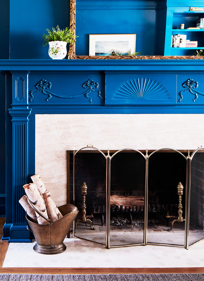
One of the highlights in the living room is the fireplace surround tile. A honed Chateau de Sable Hexagon tile from Mediterranean Tile feels crisp, clean, and serene. A log holder in an antique finish adds a dose of old-world charm while also being fully functional during chilly Northeast winters. Come summertime, the vessel can double as a magazine holder or a secret storage spot for the kids’ toys.
To inject more neutrals into the space, I chose floor-to-ceiling drapery panels with airy fabrics. Window Works brought these window treatments to life with panel fabric in Romo’s Itsuki Oyster, and sheers fabric in Robert Allen’s Kazak Stone. The look is ethereal, and an excellent complement to Circa’s Graphic Large Two-Tier Chandelier. Strategically placed art lights – Cabinet Maker’s Picture Lights, also by Circa – illuminate the custom millwork.
A muted shaped area rug by Crescent Carpet installed by Exceptional Flooring, is what allows this eclectic living room design to work. I always say that if everything is competing for attention, you’ve got the Bellagio. As a designer, it’s my role to decide which part of the design should be the star of the show and which pieces should be supporting characters. Some elements take center stage – in this case, the color – while others recede. This textural area rug grounds the room, and connects its multiple seating groupings, exactly what the room needs.
The Dining Room
My clients love to entertain. The dining room is a true gathering spot. Transitional design – one foot in traditional and one foot in contemporary – is the right fit for this room.
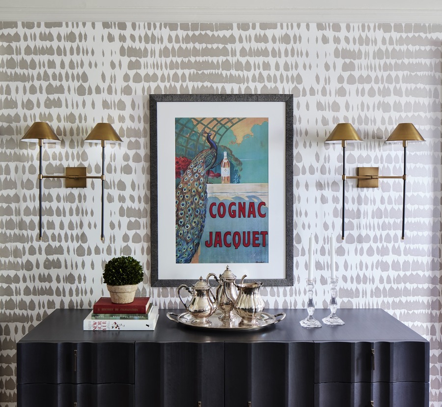
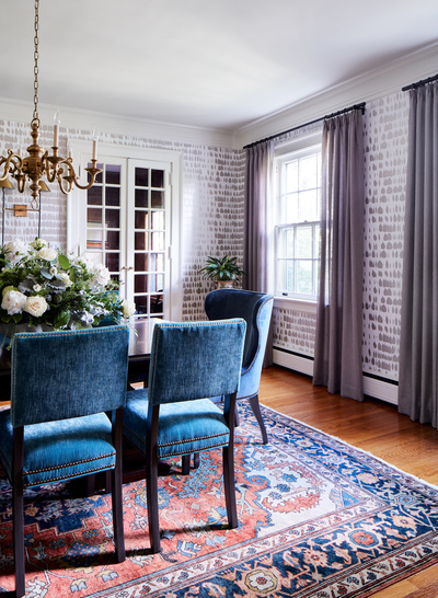
The area rug and the chandelier are the clients’ existing, and are both rooted in tradition. The wallpaper, sconces, and the use of color, on the other hand, feel contemporary.
Bernhardt’s Haven Dining Table in Haven Brunette wood finish is a classic counterpoint to dramatic seating. Vanguard’s Ava head chairs in Perennials Big Softy – Bluestone and Newton side chairs in Romo’s Orion Velvet Lagoon usher in some of the blue tones from the living room.
Threading rooms together is so important. This space feels unique, but related to the adjacent eclectic living room design.
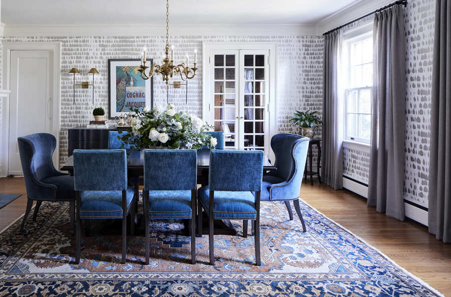
The clients’ existing Oriental rug lends vintage flair to the space, but it’s Schumacher’s Queen of Spain wallpaper in Warm Silver that steals the show. The Schumacher colorway was inspired by the client’s antique tea service. This timeless wallpaper truly brings the room to life. The silver has a light sheen to it that sparkles every so slightly – gorgeous when the light hits it just so.
Arteriors’ Havana Sconces add a contemporary pop. They are perfectly suited to the space, framing a great vintage poster that is the clients’ own.
Window Works gorgeous floor-to-ceiling drapery accentuated the view. The window treatments’ face fabric is Donghia Sahco, while the lining fabric is Robert Allen’s Lisseri – Twig. Clean, yet powerful.
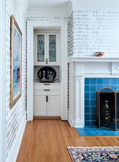
To round out their entertaining space, we suggested turning an old closet into a built-in serving station. A Quartz counter and Rocky Mountain hardware (Catch Cabinet Pull) elevate the small space into a truly sophisticated corner. The fireplace features tile that is original to the house, and again, hints at the blue hues flowing throughout the first floor.
Vanguard’s Ava Buffet has a beautiful, scalloped edge, and is great place to store china and serving ware. Beautifully stacked books and a topiary create visual interest and bring in hints of color and texture.
The Foyer
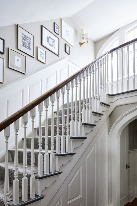
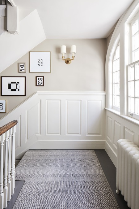
Because the eclectic living room design packs such a punch, my clients and I made a conscious decision to keep the foyer neutral and clean. A fresh coat of paint, an interesting stair runner, crisp lighting, and a well-placed gallery wall completely revive the space. It’s now warm, welcoming, and open.
The staircase runner is Prestige Mills’ Findley runner in Graphite, installed by Exceptional Flooring. Its soothing tones are exactly what this entryway calls for.
Circa’s Wilton Double Sconce brightens the top landing, ideal for illuminating the stairs late at night or early in the morning.
The gallery wall is a true highlight of the space. Picture frames by West Elm are easy to swap pictures in and out of, great for a growing family who wants to interchange their memories.
This project was exciting to work on because the clients really let me run with their inspiration. They wanted bold color and trusted me to steer them in the right direction. As a result, their eclectic living room is one of the most-used spaces in the house. The whole family lounges there on weekends, and during the weekday, two busy working professionals have the chance to reconnect and unwind together, nestled in with their favorite book and a glass of wine. Soft music playing and lights dimmed low.
Now that’s what I call a sense of place.
 Wanna’ know how to make your home feel more welcoming?
I’ll send you tips on how I do it.
(Bonus: Shopping list included)
Get the Guide


Definitely love the designs and combination of color walls!. Thanks for sharing this helpful article!