Montclair, NJ is a cultural and artistic mecca located thirteen miles from New York City.
The town is rife with parks and nature reserves, and homes are historic and full of soul. Interior design here reflects the surrounding suburban area while nodding to the metropolitan pulse of Manhattan. I was thrilled to renovate a 100-year-old Tudor for modern times while honoring the home’s original bones.
Our process always starts with how clients want to feel in the space. In this case, our clients wanted to feel sophisticated, relaxed, and joyful. Great direction to work with, right? They also wanted to honor the old home’s existing Tudor charm while updating it for how we live today. They didn’t want the typical white kitchen, and were drawn to the vintage/Gothic/Tudor vibe we presented early on in the project. Richer finishes, warm wood tones, art, wrought iron, color, and texture ruled the design.
We worked on their kitchen, sunroom, and soulful primary suite. The project was harmonious, with all of us working together towards the same end goal: beautiful interior design in an airy Tudor.
Kitchen
Prior to our project, the space was split into a laundry room, a small pantry, and a separate kitchen. It was dark, drab, and not functional for the homeowners, who love to cook. The look was country cottage, which did not match our vintage Gothic direction. There was a lot of wasted space and no place to gather for meals. Dated wallpaper adorned the space and wood cabinetry felt average.
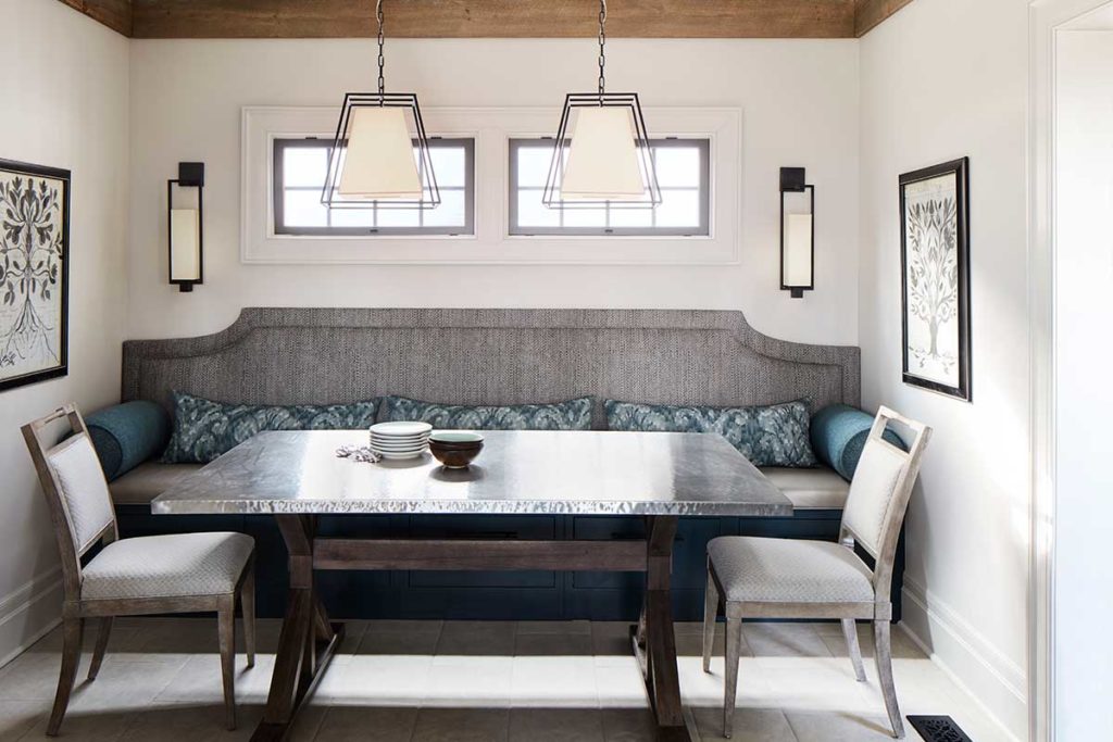
We decided to open up the space and create an open eat-in kitchen. We removed a wall between the existing kitchen and old laundry room, and created a custom banquette. It was built in from wall to wall, and the base is made of a vinyl material that is practically indestructible.
The banquette features wonderful lumbar pillows that make this little nook very comfortable. To accent the space, bring in natural light, and create a little elevation, we added eyebrow windows and flanked them with the Staffa sconces from Sonneman. Along with the sconces, we hung two pieces of art from Spicher and Co, both of which create a feeling of “come, sit, relax…”
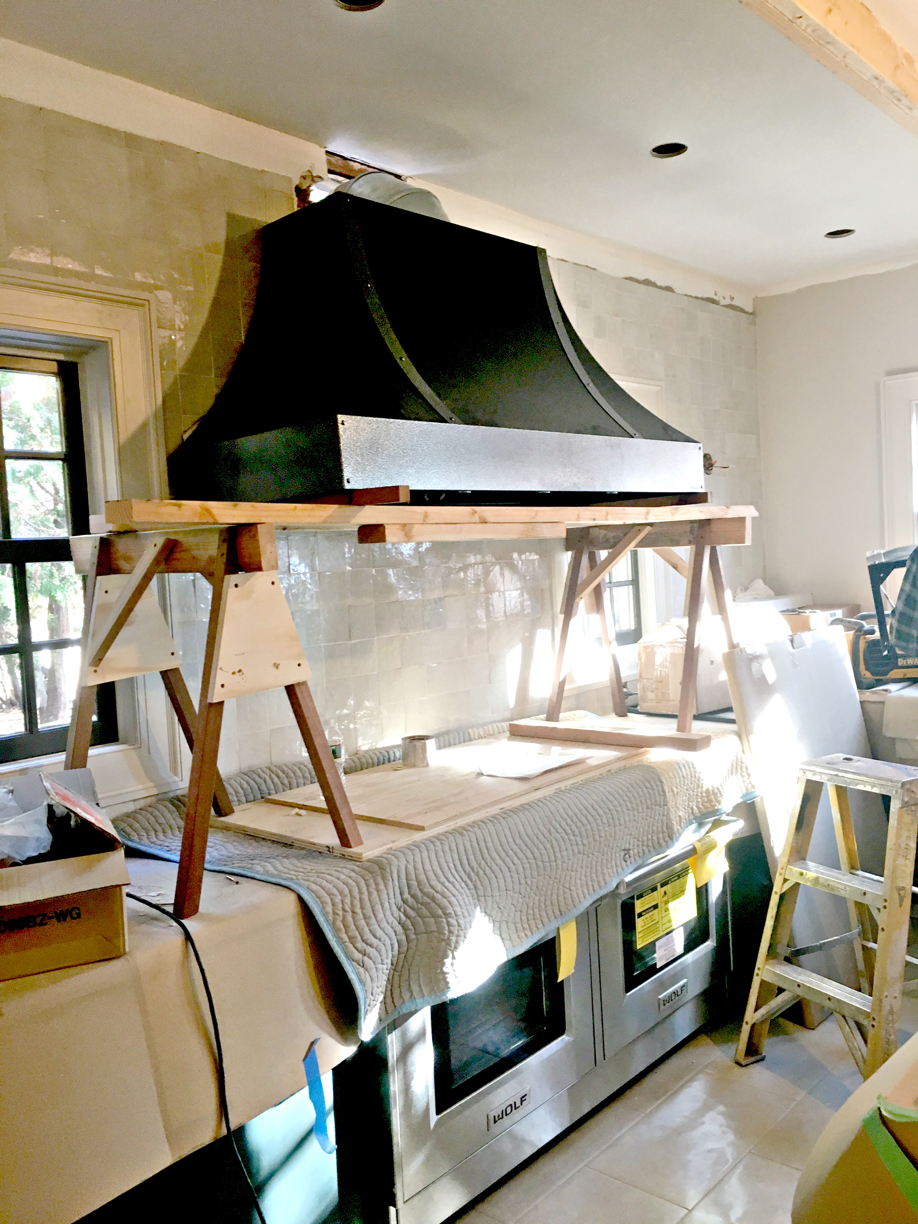
As far as the appliances are concerned, we obviously weren’t hiding the 60-inch Wolf range and gorgeous custom hood. The clients supplied all of the appliances and even gave their existing Sub-Zero fridge a facelift by installing new panels and hardware. We used panel fronts on the rest of the appliances to give a more consistent look to the base cabinets. For instance, we added a 36” Sub-Zero drinks refrigerator, a pull-out trash compartment, and a great lower-level microwave in the island.
The center island is one of the key items we were able to incorporate during the renovation, instead of the previous freestanding kitchen table. The island’s tactile leather finish was chosen specifically for its durability, movement, and interest. It’s a great space for prep and sharing meals with friends and family.
We have a great farmhouse sink by Blanco, which we turned into a great focal point by flanking it with a super-sneaky dishwasher and another pull-out trash station. Another amazing trick is the wall that houses the 36″ Sub-Zero refrigerator.
To keep everything modern and clean, we built out the entire refrigerator wall and flanked it with matching pantry space with deep drawers below. The main fridge also has a panel front designed to match the surrounding cabinetry of the kitchen.
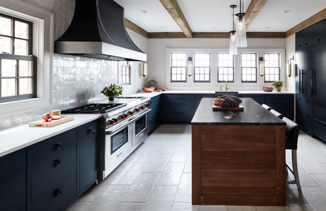
A big part of what stayed in the kitchen are these windows. The windows were original to the house when we found it, but to give it that House of Funk touch, we added the beautiful trim and the light fixtures to draw even more attention to them.
All of the hardware is stunning. Great big pulls on the cabinets and really detailed hang pulls, all in antique iron. The drawers were fitted for glassware, plates, utensils, and all the gadgets a home cook needs. There is also additional storage in the base of the banquette in the eat-in nook.
I love to design a kitchen without upper cabinets whenever possible, so this was a complete dream. This is a true cook’s kitchen, this is not for show, and these things are all used.
I knew from the beginning that this family wanted a more functional cook’s kitchen. We worked with Classics Reborn and Crown Point Cabinetry to maximize function and storage throughout the project.
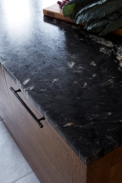
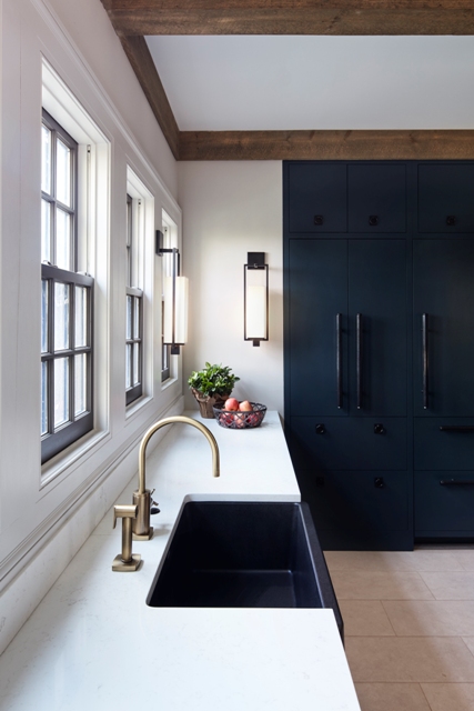
Image via House of Funk | Photography by Mark Weinberg
At mealtime, the family now gathers around Bernhardt’s Stockton Gathering Table, customized to accommodate our seat height, and catches up on the day. Maria Dining Side Chairs by Vanguard tuck nicely into the table’s ends, and Hudson Valley’s bold Kyle Pendants round out the dining nook.
The dining table isn’t the only space where family and friends gather for meals and interesting conversation. A richly textured kitchen island is home to cool Gin Fizz/Harvey Wallbanger Counter Stools by Vanguard, and Sky Pendants by Sonneman. It’s the place to be while helping with dinner prep or after supper for a nightcap or cup of tea.
Details that make this kitchen sing are a custom-designed stove hood from Vent-A-Hood, a Blanco Ikon Front Apron Sink, and a hand-glazed terracotta backsplash tile by Zellige.
Unique accessories such as Arterior’s Sylvie Cloche and copper Spry bowls by Global Views lend extra refinement to the space, and work well for storing fresh produce.
 Wanna’ know how to make your home feel more welcoming?
I’ll send you tips on how I do it.
(Bonus: Shopping list included)
Get the Guide
Laundry Room
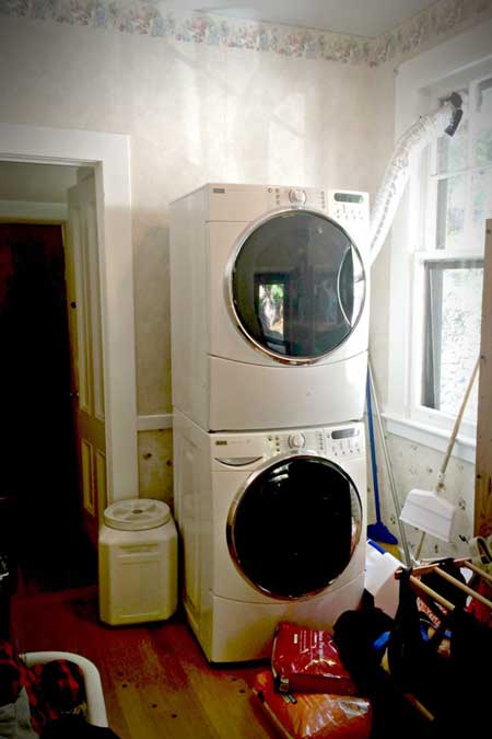
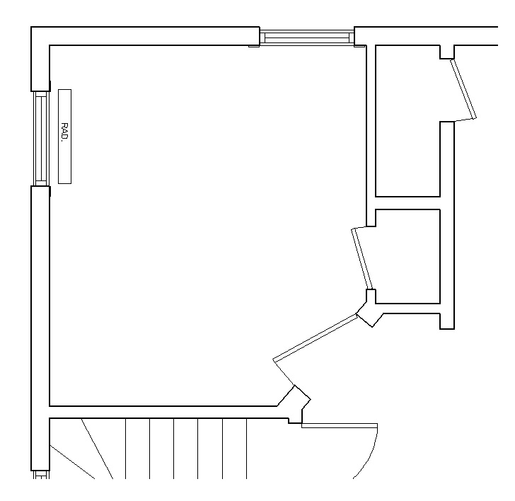
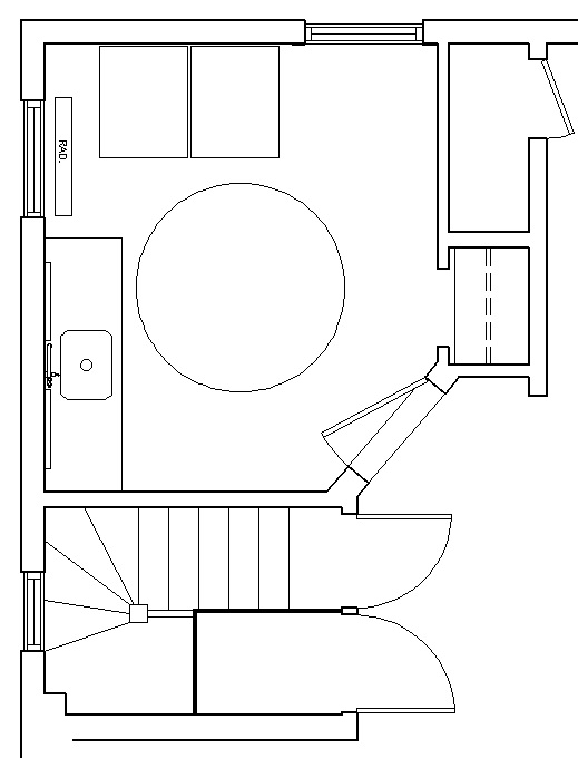
The laundry room was originally a fairly basic space housed in a separate room next to the kitchen downstairs. My team and I spent time looking through the house for other locations that would be better suited to a laundry room. A tiny little guest room, opposite end of the hall from the primary suite, was a perfect fit.
We kept the original windows and added café curtains in a chunky texture in neutral tones to complement our charcoal and ivory direction. This allowed us to bring in softness, which was really important, and to highlight the gorgeous windows.
Another feature in this room are the simple, yet beautiful, cabinets with great bin pulls in polished chrome. Polished chrome is a great choice here—economical and wonderfully durable. We opted for an amazing Kohler bar sink to make the space feel sophisticated and special. We worked with our stone vendors to find out which of the stones we had extra material of, then worked out a plan to use that amazing stone throughout the rest of the house. And that’s how this gorgeous Caesar stone came to be in the laundry room.
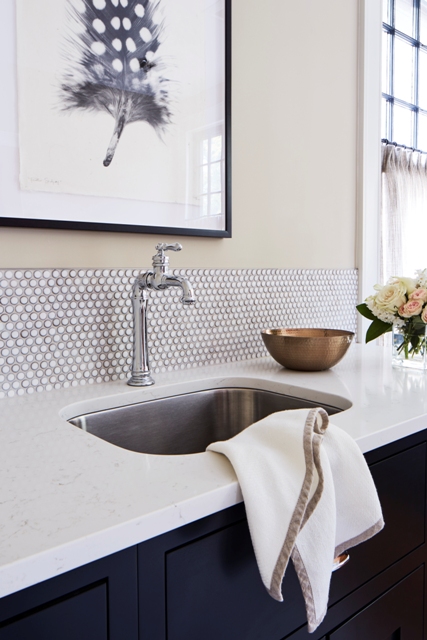
The backsplash is a beautiful, glazed, white penny tile. If you look up, there are these amazing star lights with circle glow lightbulbs. Instead of a grid of recessed lighting, we opted for the star lights to add interest, light bounce, and a touch of whimsy. This star Bethesda Flush Mount light is from Hudson Valley Lighting. The laundry room features two original, signed and numbered, pieces of artwork from Barloga Studies.
Artwork can be had at all price points, it’s just a matter of looking in the right places.
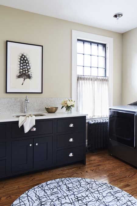
We kept the original (and beautiful) radiator in this room. To give it a bit of a makeover, I had it painted dark, like the cabinets. A couple of beautiful accessories go so far to make things beautiful. The decorative bowl, with its great sparkle and detail, is a wonderful catchall for storing change and other forgotten treasures from pant and jacket pockets. Liora Manne’s Wrapped Boxes Grey rug in a custom round size is playful and functional. Its sepia and charcoal tones complement the layers of white, ivory, sepia, linen, gray, and charcoal tones that were utilized in the space. It’s also extremely durable (exactly what you want in a high-traffic area). Beautiful, fresh flowers are also a great addition to the space.
I am such a fan of fresh flowers. It adds a Parisian flare to any room—it’s that way of picking up a couple of fresh ingredients and a hand full of fresh flowers at the market.
Primary Bathroom
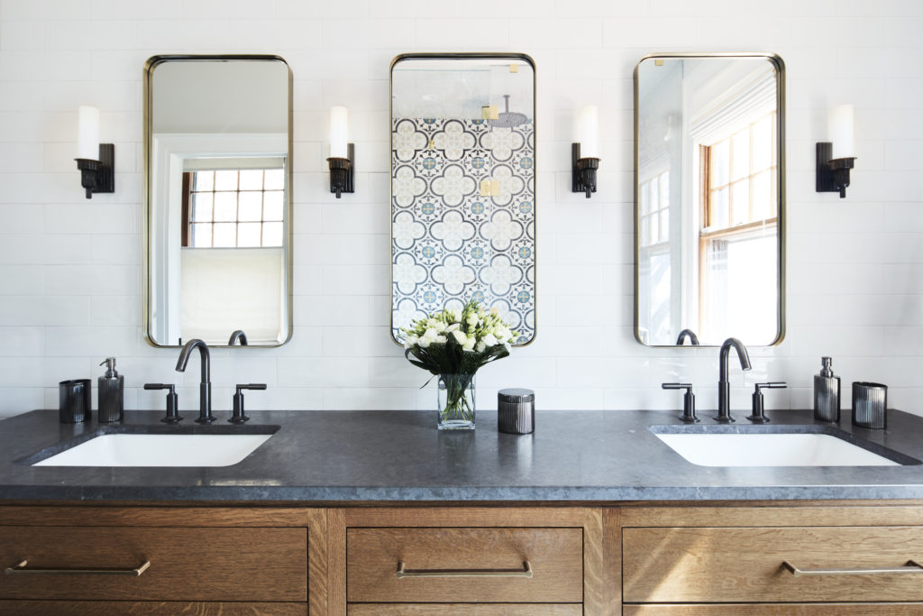
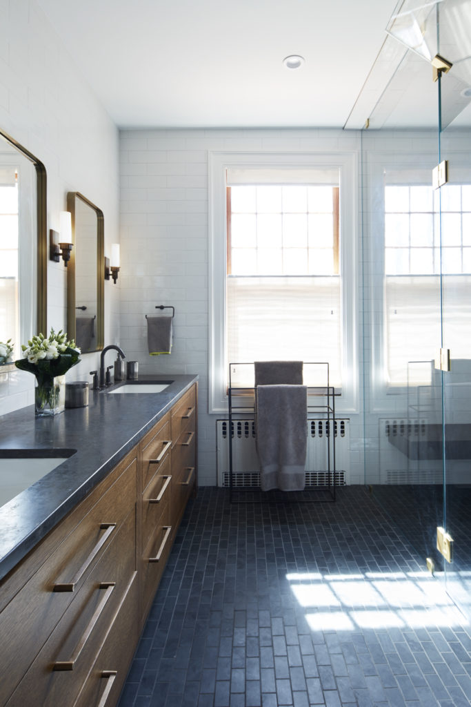
Picture this: You’re tired, late, the kids need you, and you are waiting for your turn in the bathroom. Sound familiar? Two sinks and lots of cabinet drawers ensure that this husband and wife have ample storage for all of their beauty and grooming necessities. Silver accessories by Pigeon and Poodle feel modern but don’t take up valuable counter space.
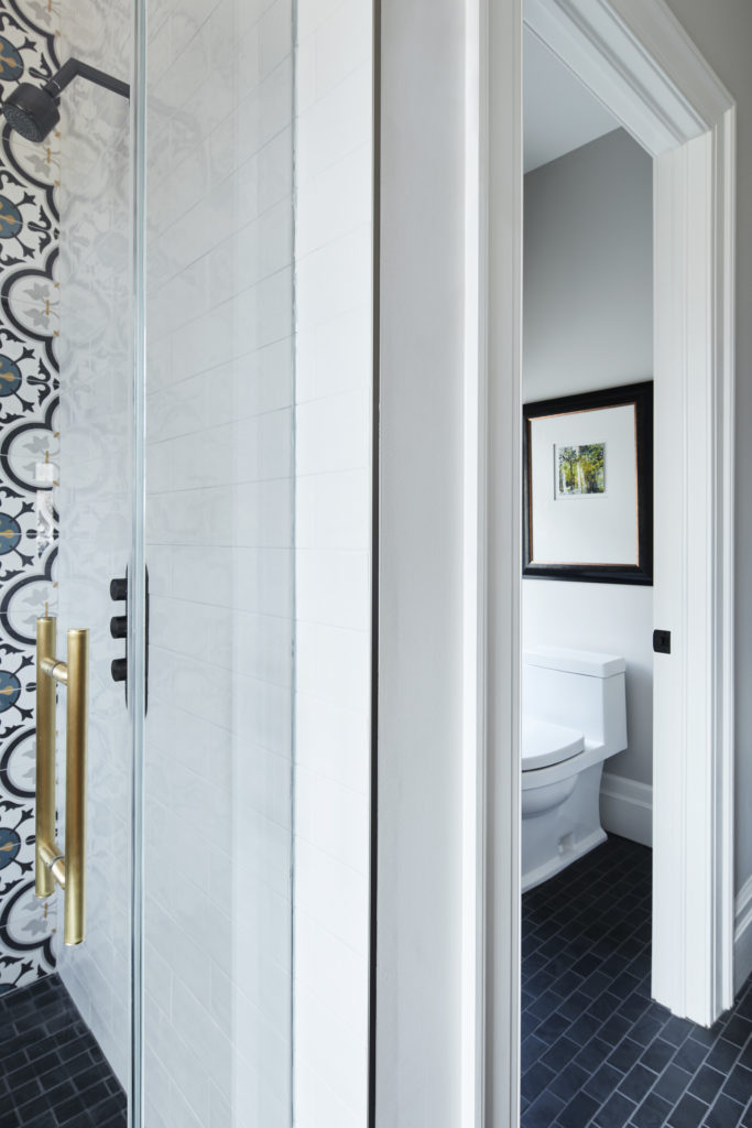
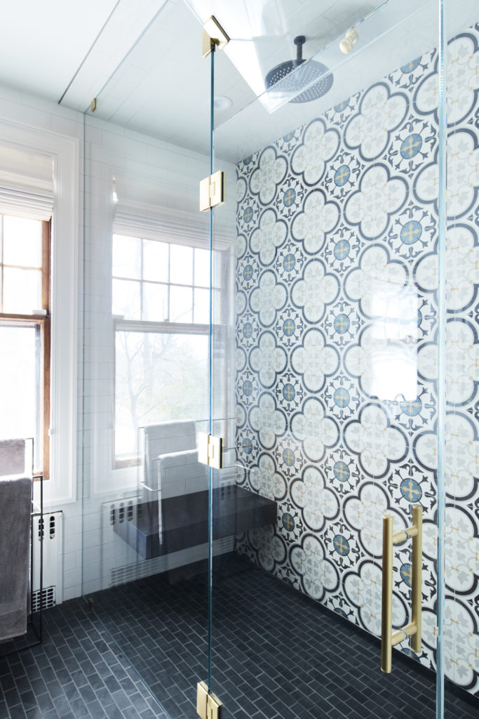
I like to flank bathroom mirrors with sconces as it creates even lighting. The standout feature in this room is the incredible, custom colored and handmade for House of Funk shower tile by Mediterranean Tile. It instantly transforms the entire room into an exotic oasis, one where the day’s stress and to-dos melt away. The homeowners love the tile’s vibrant pattern and energy. A separate water closet allows both of the homeowners to get ready with privacy.
Primary Bedroom
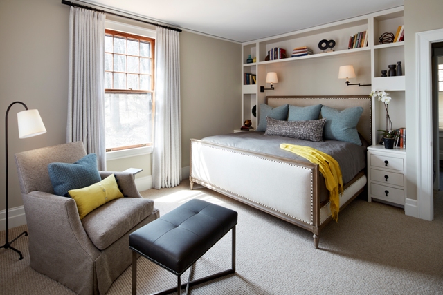
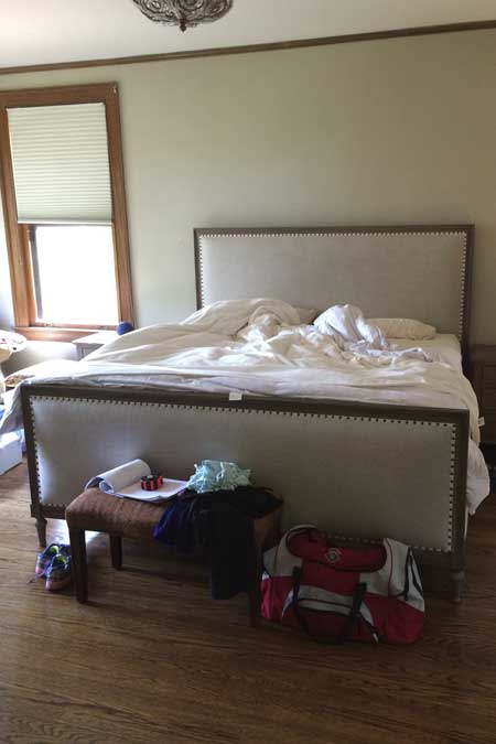
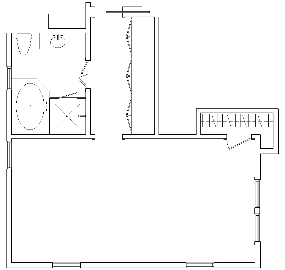
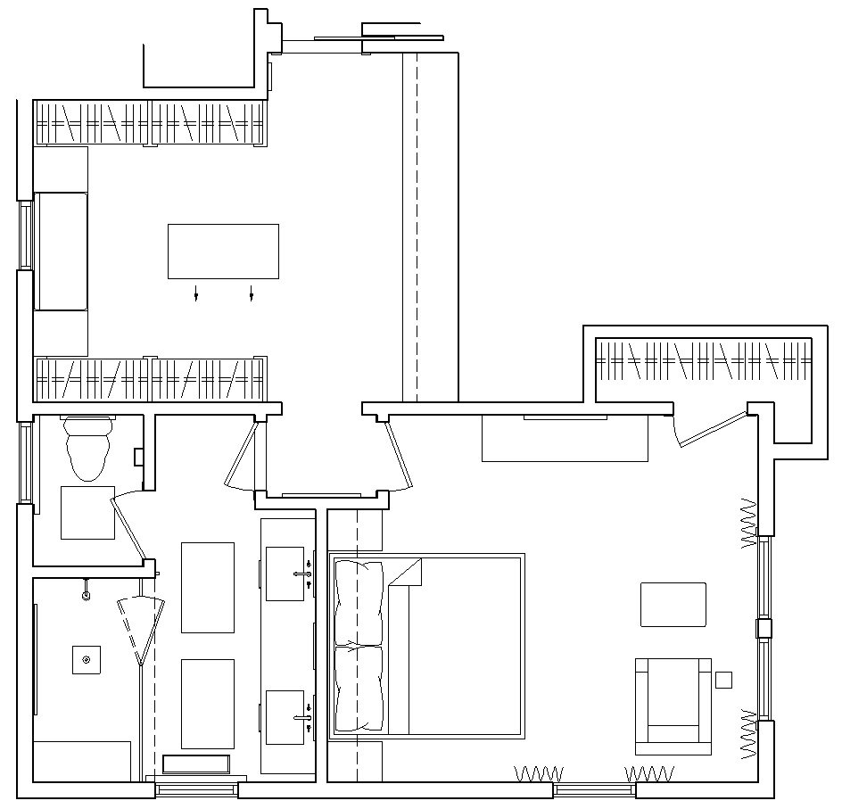
This project also included a complete gut renovation of the primary suite, which consisted of a large primary bedroom, primary bathroom, and a hallway. Now the homeowners have a smaller, but still nice-size bedroom, a large bathroom, and a beautiful walk-through closet.
A plush, Lee Industries armchair is ideal for settling in at the end of a long day, and a small Martini Table, also by Lee Industries, is there to hold a drink, book, or, let’s be honest, device. Vanguard’s Jersey Ottoman can easily be moved as needed. Carpeting by Moomjy Carpet & Floor is neutral and a great backdrop for pops of color courtesy of accent pieces like a bright throw and lumbar pillow.
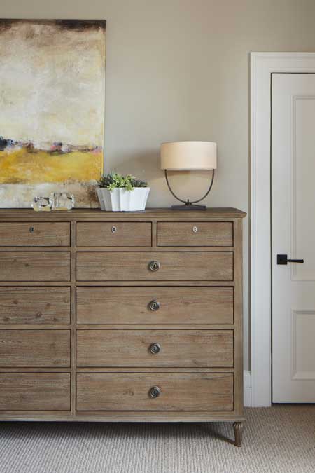
Good lighting was key to this primary bedroom. Circa’s Griffith Swing Arm Sconces offer just the right amount of lighting for late-night reading in bed, while the Mia Floor Lamp is great for curling up with a book.
The artwork is La Rivière by Matt Camilo for Saatchi, and its lush colors are a nice mix with Circa’s Kenton Desk Lamp which features a natural paper shade.
A few unique accessories rounded out this primary bedroom, with favorites including a Baroque Box by Arteriors and Gemstone T-Lite/Bud Vases by Global Views.
Primary Closet
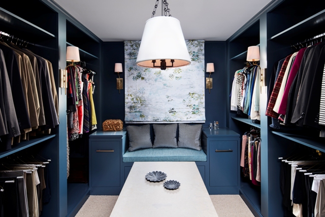
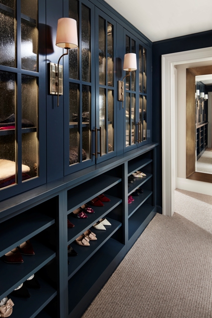
This closet was built to accommodate the needs of two busy professionals. The clients needed easy, organized access to their clothing, shoes, and accessories. The closet’s rich and moody hue is a great backdrop to the visual riot of a wardrobe on display. Highlights include a comfy built-in banquette seat with graphic pillows. The Vidalia Lotus trays from Pigeon and Poodle featured on the center island are great catch-alls for dainty jewelry, loose change, headphones, and everything in between.
Overhead, Hudson Valley Lighting’s Burdett Pendant adds a dose of drama while the brand’s Glenford Wall Sconces keep every area well lit. A stunning full-length floor mirror by Arteriors makes a statement and allows the homeowners a good view of their ensemble before heading out the door.
Sunroom
This room was straight crazy. When we came in here we knew right away that we wanted to peel it all back and have this be about the indoor-outdoor feeling that our clients desired. We immediately started calling it the sunroom.
Before our redesign, the sunroom was a visually busy space directly off of the family room, with heavy, faux tile covering all but the ceiling. Boring blinds and the faux stone walls took away from the amazing view and made the space feel very closed in. Corner cabinets housed radiators that gave way to radiant-heated floors which are a more efficient, space-saving, and cozy alternative.
Prior to making any changes I spoke with the clients, and a huge part of what we talked about was “Why would you ever come into this room?” “What’s going to bring you here?” and then, “How do you want to feel when you’re here?” So we talked a ton about coming here and being able to relax while keeping the space feeling very open and airy, and connecting it with the outdoors.
The Sunroom Before
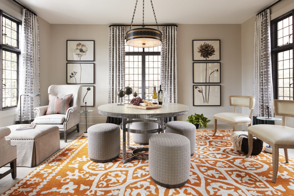
We created a cozy and functional reading space. The two shapely Tivoli Wing Chairs from Bernhardt are specifically made for lounging. I accented them with custom pillows in a vibrant, embroidered fabric. A custom ottoman sits between the wing chair—wonderful for sharing. As every chair should have a reading lamp and a convenient place to rest a drink, I’ve rounded out this pair with Circa’s Wlliam Pharmacy Floor Lamp and side tables by Arteriors. This furniture grouping has Sunday morning written all over it.
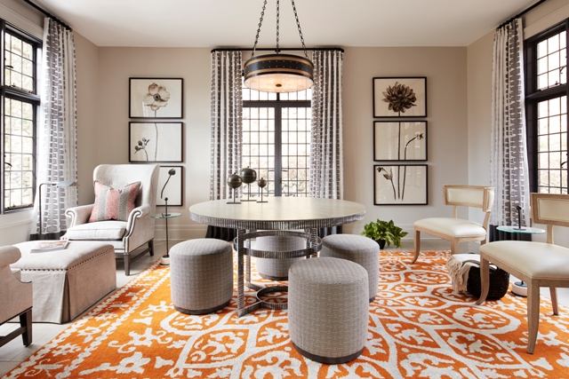
The chandelier is by Hudson Valley Lighting in old bronze. The Tritter Feefer dining table has a textured, light wood surface and features a strong metal edge banding and base. The table pairs perfectly with the Haskell Ottomans from Vanguard Furniture, making this dinning area the best place to lay out a puzzle, mull over the latest news, or indulge in a bottle of wine. The handmade iron Rocco Orb Sculptures from Arteriors. The Haskell ottomans tuck away nicely when not in use. We had layers and layers of neutrals, grays, and charcoals, and I wanted to bring in a big punch. The copper stone wash Safavieh area rug was the perfect addition to do that. It’s a great jute and natural wool with this amazing orange pop.
I am always layering in my materials, colors, and textures in order to balance that masculine and feminine feel. That’s what inspired me to add in those accent pillows which feature a pop of pink and orange with a graphic charcoal punch to it.
The Single Dahlia Trilogy and Anenome Trilogy art from Barloga Studios are great pieces of art. Those charcoal and sepia tones and details create a dramatic, yet calm, moment.
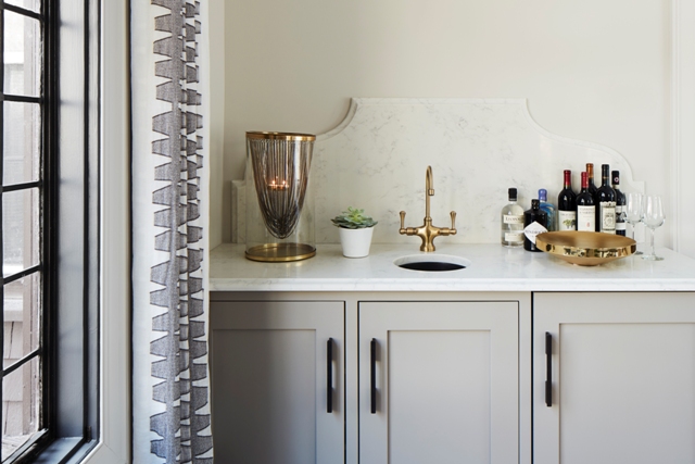
We created a wine bar and a space where the clients could have a cocktail or an appetizer prior to having dinner. The bar, as you see, is an alluring area thanks to a hidden wine fridge, a gorgeous antique brass bar sink featuring a Watermark faucet, a shaped marble backsplash with Ogee edge detail, and elegant cabinet pulls in a dark-bronze patina. We rounded out the bar area with the Worth Hurricane vase and Paige tray from Arteriors and a few of the client’s favorite wines and spirits.
It’s so luxurious to have a space that doesn’t owe you anything.
Why I Love Montclair, New Jersey
For the last twelve years, House of Funk has called Montclair, New Jersey home. I started the business in my actual home in Upper Montclair, and we are now in Montclair Center. Location is such a huge factor in setting the tone of any space, residential or commercial, and I’m lucky to have an office here in town. Below, a little history on Montclair, New Jersey, and a few of my favorite local spots.
The Township of Montclair, formally known as Speertown in the early 1700s, is a family-centered town that is home to an excellent school district, a wonderful public library, a prominent baseball stadium and museum created by famed American baseball catcher, Yogi Berra, many churches and restaurants, and a thriving small-business community.
Montclair’s rich history in the arts has lead to the development of the distinguished Montclair Art Museum, and an array of quaint cinema theaters and live performance theaters such as the Wellmont Theatre, The Montclair Film Festival, and the Alexander Kasser Theater housed at Montclair State University. The Montclair History Center “promotes preservation, study and appreciation of local history,” including the four historic houses in town: the Crane House and Historic YWCA, The Nathaniel Crane House, The Clark House, and the Shultz House (also known as the Evergreens). Montclair is a mecca for artists, writers, and historians.
The town is also home to a bustling Montclair Center with a variety of noteworthy cafes and brunch spots. My favorites include Bluestone Coffee Co. (known for their infamous Bluestone omelette and challah French toast), Plum on Park (their egg crepe omelette pairs beautifully with their Sunrise Mimosa), The Corner (so.many.good.choices), Toast (the Cali scramble is always a crowd favorite), Local (artisan coffee and sweets, and the Funktado, a drink named after House of Funk!), Samba (authentic Brazilian fare), and so much more. The Crosby is a chic watering spot for an after-work cocktail, and Amanti Vino is my go-to wine store.
There are approximately 23 parks in Montclair. Personal favorites include the sprawling Brookdale Park (ideal for long walks with your dog or family time with the kids, and a beautiful backdrop for holiday photos), Anderson Park (designed by the reknown Olmsted Firm), Eagle Rock Reservation (designed in part by the Olmsted Brothers themselves), and Mills Reservation (a county park with tons of great walking trails, one of which takes you to a cliff with a stunning view of the NYC skyline). The Van Vleck House & Gardens, once a private estate, was gifted to The Montclair Foundation by the heirs of Howard Van Vleck in 1993. Today, the private gardens offer a slice of peace and quiet to residents and visitors alike.
Schools here are amazing, be it public or private (Montclair Kimberley Academy is a revered private school that fosters academic and arts programming), and a big factor for many homeowners moving from the city. Montclair State University is the second largest university in New Jersey, and only twelve miles from NYC.
The city has robust community-service organizations, including: The Junior League of Montclair-Newark, COPE Center, Toni’s Kitchen, and The Human Needs Food Pantry. There are so many ways to get involved.
If you’re looking for a modern yet suburban town with convenient access to New York City, Montclair, with its cultured community and charming architecture, is a dream.
 Wanna’ know how to make your home feel more welcoming?
I’ll send you tips on how I do it.
(Bonus: Shopping list included)
Get the Guide



Love this overhaul. It’s timeless and lush; modern without being cold or stark. We just moved to South Orange from Brooklyn this weekend (into a Tudor!) and I am excited and overwhelmed at the design possibilities. I had a chandelier similar to the Hudson Valley living room piece pinned, and I am happy to see it works so well in a room similar to mine! Thanks!
We recommend working with a designer who can show the value of the home by offering design advice to the potential buyers. – HOF
Thank you. So glad you enjoyed the post.
I just love these designs. These pictures are beautiful and classy. Thank you for sharing This Post.
We started working with homeowners on tweaking their interior decorating before we list the property and it’s made a huge difference in sale price. Our real estate agents have been looking to learn more about Interior Design so this is ideal. Do you have any advice on how to incorporate this design for those just learning about interiors?